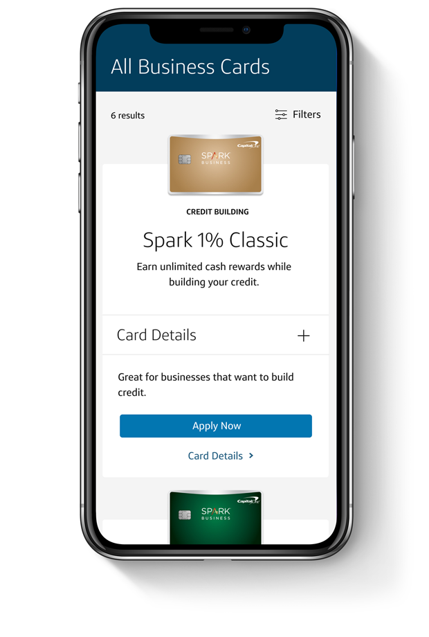
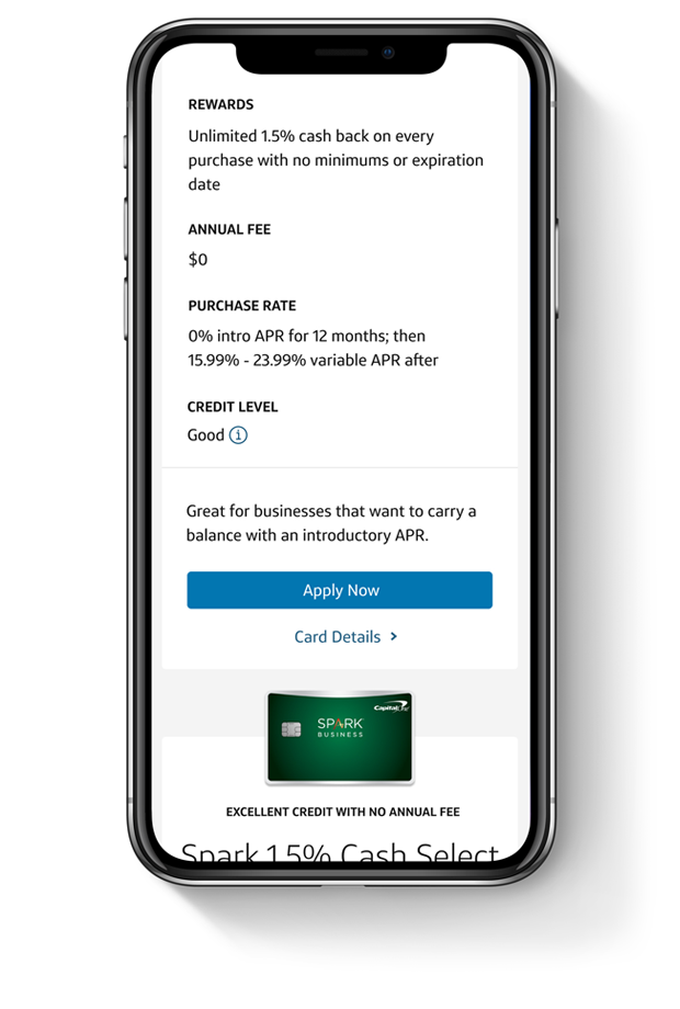
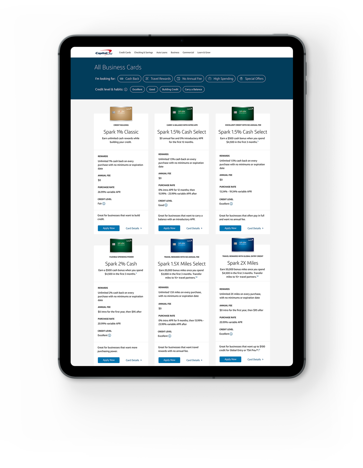
Capital One is launching three new products that are similar in name, card art, and terms. Based on qualitative research customers are unable to tell the difference between these products and unable to choose the correct card for their business type and credit habits.
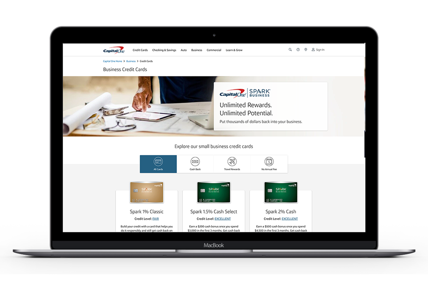
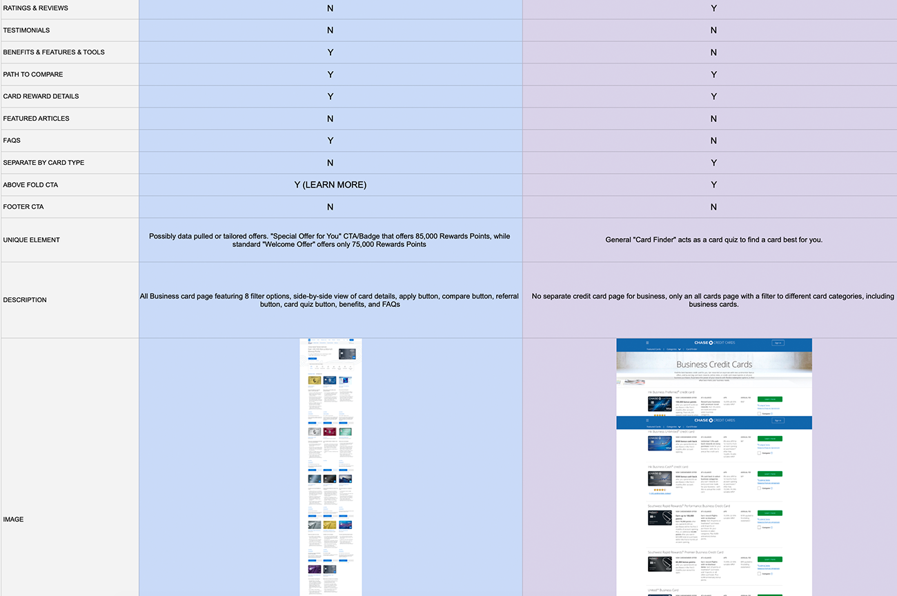
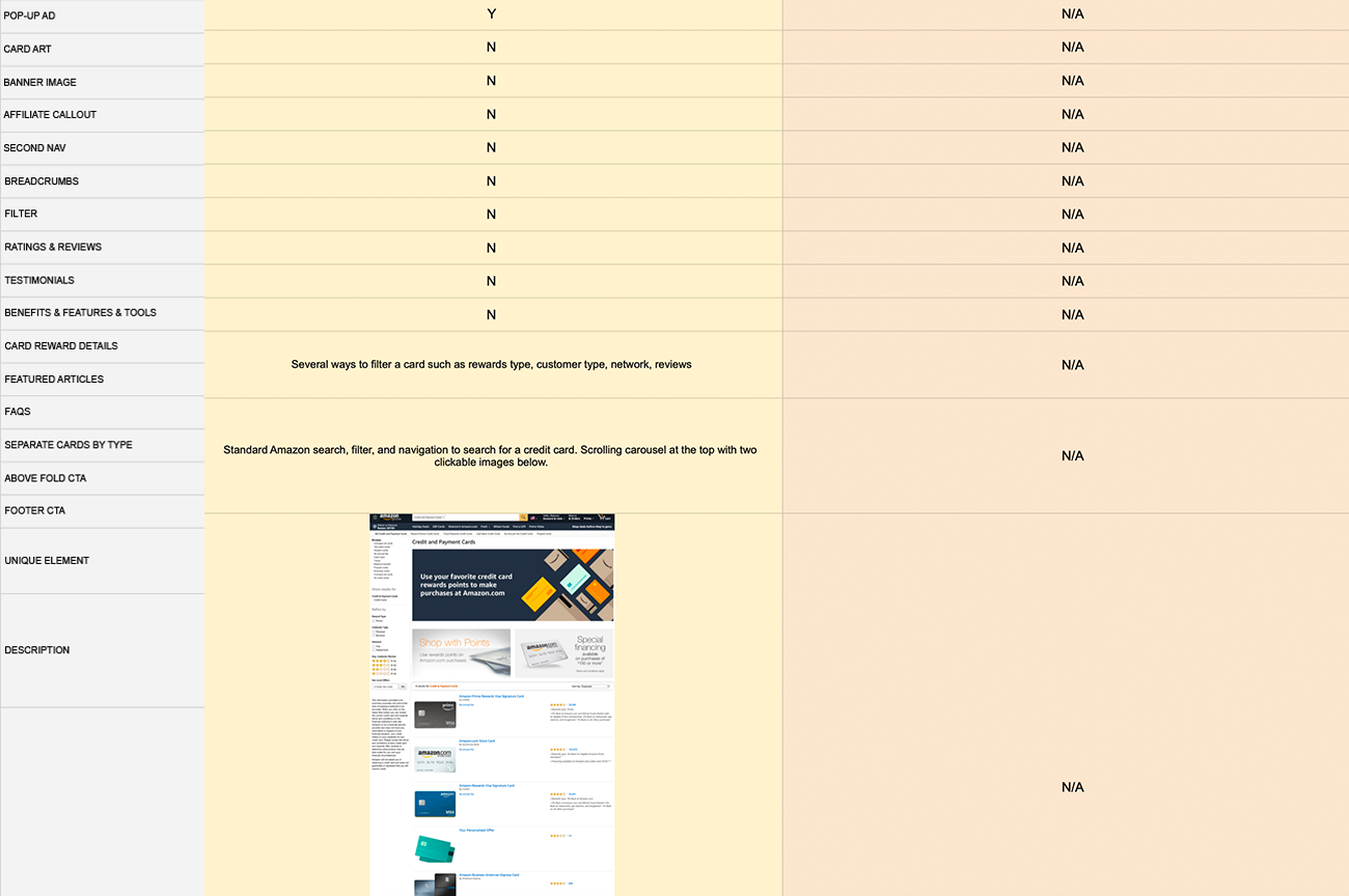
To understand where and how the all cards page was underperforming I conducted a competitive scan and also referenced past data and research. Overall, I discovered that the all cards page is insufficient amoung our competitors, with customers, and with Capital One's business goals.
Business owners are unable to differentiate product offerings to choose the correct card that they will get approved for.
The current all cards page does not meet the business' need to scale for new product offerings or differentiate products at a glance.
Due to brand restrictions, Capital One is unable to change the name or card art for their new products which negatively impacts decision-making.
Focused on narrow archetypes for the Business Card website team in order to understand the behavior of business owners on the website. In general, all business owners who come to the Business Card website have a certain level of interest in applying for a new credit card for their business.
I conducted a competitive scan to provide insights of competitor design solutions to improve the all cards page based on past user learning. Based on competitors the current all cards page does not provide a clear difference between each product, use a robust filter, and does not allow business owners to compare from the current experience.
Unlike Capital One, half of the competition had a compare experience from the all cards page.
Capital One met the competition by having a filter, however fell short due to limited filter options.
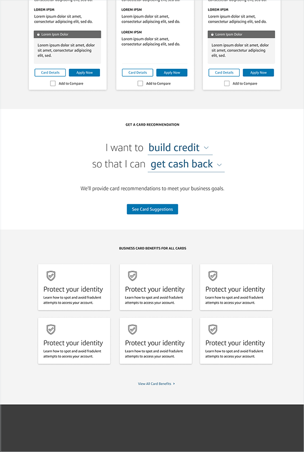
Unlike Capital One, half of the competition provided a card quiz or guidance tool to assist with decision-making.
In order to create an effective all cards layout that will guide customers to important content, I led the team in a value mapping exercise to align on the combined goals of Capital One and their customers. Each goal was based on foundational research and data to deliver on customers' needs and expectations.
How might we help business owners understand the differences between each product to make a decision?
How might we help business owners find the best card for their business size, spend, and credit habits?
How might we be transparent and help business owners know which card they will get approved for?
Allow business owners to compare and differentiate products at a glance.
Assist business owners with a filter, product-fit, or guided selection.
Communicate change in product offerings and spending capacity.
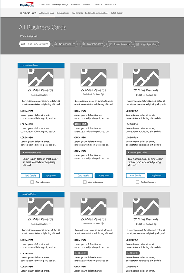
I created wireframes to consider the information hierarchy prior to introducing visual elements. The goal of the future Capital One Business Card all cards page is to differentiate products both from one another and the market, help guide shoppers to the right product, and enable comparison.
We conducted qualitative research to understand the dynamics of product selection and what design elements assist business owners with differentiation. Our main findings were that while it did help participants with comparison, some participants were still unable to differentiate between 3 products due to similar card art and names.
Majority of participants said they would use the tiered filter, especially the credit habits, to narrow down card options.
Participants liked the horizontal lines to separate content and easily compare across products.
Participants liked the "great for" section since it helped them understand the unique benefits of each product.
Participants were unable to understand product differences at a glance and disliked the length of card details.
Based on research findings, I focused on 3 main areas to improve for an A/B test. During that time, I also collaborated with tech, brand marketing, and assited with quality assurance prior to release.
Added a title at the top of each section to highlight the differences between each product and to help where branding has failed.
Updated the horizontal lines to only be used for grouping key content to reduce column height and improve scanning of information.
Updated the "great for" section to only highlight the main differences for each card to assist with comparison across all products.
After the month-long A/B test was complete we confirmed that the new all cards page improved customer's ability to compare products at a glance in order to apply. This is shown in our data results, as the total application start rate was increased by 1.6%.